My Blogs

Tuesday, 28 September 2010

Heraldry Research

During our time in the V&A Musuem in London we came across some heraldry and was required to research it during the lesson last week.

So before I begin...

What is Heraldry?

Heraldry gets its name from the heralds who were the official representatives of kings and lords. It was the herald's duty to keep track of family relationships and of the intricate etiquette governing coats of arms. Heraldry is a system of hereditary identification using visual symbols called coats of arms, or armorial bearings. In origin, armorial bearings consisted of a variety of conventional devices, or charges, displayed on the shield, or escutcheon, of the medieval knight. The practice of displaying the same emblem on the knight's surcoat, or tabard, the tunic worn over his armor, gave rise to the expression coat of arms. The use of such symbols, which became increasingly elaborate, soon spread beyond the military field. Thus, the study of heraldry covers the origin, development, and significance of coats of arms and the official regulation of their use by individuals, families, political units, and social organizations.

When did it begin?

Heraldry itself dates from the beginning of the 12th century, when coats of arms began to appear and were adopted rapidly throughout Western Europe. These symbols were developed because of the military necessity of identifying armor-clad warriors, whose faces were covered by helmets. Because of the Crusades, in which men of many nationalities were involved, the idea of heraldic identification spread readily among the nobility of Western Europe. Because the majority of the nobles could not write, their coats of arms were soon incorporated into the design of the wax seals with which they stamped letters and documents. Within a short time coats of arms were adopted for the same purpose by clerics, lawyers, and the heads of corporations such as colleges, merchant companies, and towns.

Although heraldry started in the noble classes, in some countries (such as Germany, the Low Countries, Italy, and Scandinavia) it came to be used by the burghers, giving rise to non-noble, or burgerlich, arms. In the cities of Italy and in the Alpine regions, patricians--who were accorded equal status with the landed nobility, although not descended from them--also adopted the use of heraldry.

Blah, blah, blah!


Anyways.

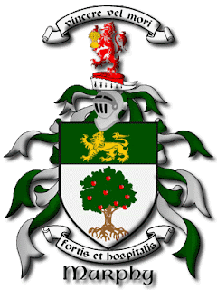
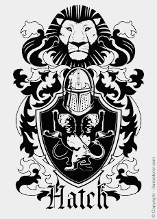
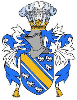
Here are some images I found through Google images;
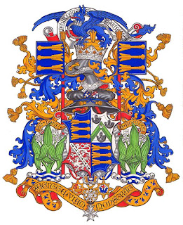


So now you understand what Heraldry looks like. I did just so happen to take a few snaps in the V&A Museum, but not enough. However, I intend on using the visual resources I have found and draw hand rendered sketches of them.

Thursday, 23 September 2010

London Trip (16/09/10)

http://i213.photobucket.com/albums/cc147/empee123/Ashley.png

ND Graphic Design YR 1 & 2 set out on a trip to London.

We finally arrived in Kensington, London...


We then made our way to the V&A Musuem. On our way there I decided to take a few photo(s) of the surroundings in Kensington.

The image below is just a photo I took of the Underground Tube Station on the way as we travelled to the V&A Museum.


As we continued our journey towards the V&A Museum, I came across some construction over the road which advertised the V&A Museum;


We finally arrived...


Here are some of the snaps I took in the museum. Unfortunately, I never caught the names of the artwork;


National History Museum logo just before we entered the building.


(I can't remember whether we visited the NHM or the V&A Museum first though :S)

Tuesday, 14 September 2010

Summer Brief

OBJECTIVE

For this summer brief I have been requested to produce my own camouflage design based on personal objects that represent my identity. The camouflage doesn’t have to be neccessarily be like the army/military style so to speak. Alternatively, you can freely design it however you feel. Innovation is the key.

The five objects I chose that represent my identity are the images you see below;

LOGOS


Just to clarify why I have chosen these specific things, I have briefly explained below;

Superman - I chose this because it’s a visual resource I tend to gather my inspiration and motivation from just by simply watching and admiring the level of skill DC Comics
incorporate into making these cartoons/movies. It is definitely a field of work I definitely would want to be apart of.

Batman – Same as the above really. Also, he’s my favourite superhero!... Yes I am a big kid.

Vans – For most people that know me very well, I tend to wear Vans a lot as I am not a big fan of trainers as much these days. But my trainer collection will soon stock up. So you can consider Vans apart of my identity.

Apple – I have an iPhone4. This is my new identity. Enough said.

New Era Fitted Caps – I’ve always been a hat person ever since I was a nipper. I would even try on my granma's favourite hats and they'd suit me too! So yes, this is also apart of my identity.

Anyways...


Concept

With the logos you seen above, I had an idea to hand draw them and then merge them together to perhaps create a more effective camouflage. Seeing as camouflage is about blending and contrasting, I thought I will do something such as a contineous line style of drawing.

The image below is a rough draft of what I hand drawn and then scanned to be digitally illustrated;


In the process of actually drawing the background I found myself slightly clueless because I wasn't sure how to do the camouflage patterns so I looked on Google images and found some visual resources. Here we have is a variety of different camouflage patterns;


The camouflage patterns I found immensely influenced me on how I approach my own style. I made random shapes using the khaki colours as the background and made the logo’s contrast with it.

However! Initially, I was going to outline and fill in the original camouflage patterns I drawn but I wasn't really satisfied with it. I felt it was too busy and detailed. So I decided to do something a little bit more different and simple.


6 simple steps...

- Use Adobe Photoshop/Illustrator

- Use Pen Tool to trace the logos on the original image.

- 5px brush stroke to outline the logos.

- Use Polygonal Lasso Tool to create the abstract shapes you'll see in the background. Click, hold and move around the tool to make a shape.

- Once the abstract shapes are selected, use the fill bucket to make the khaki colours.

- For the grunge effect, I used a texture as a overlay and adjusted the layer to Multiply above the layers section in the drop down box.


Moving on...

Change of Plan...
I also decided to make a slight adjustment by cropping the image and showing only parts of the logos as I thought it looked better that way which you’ll see in the final piece.


FINAL OUTCOME

*Drum rolls*

...


For the record. As you have proberly noticed... I don't have any visual resources from any artists. Reasons being is because I wasn't influenced by any artist to create my final piece. This was simply an idea thought of on my own.